2026.08.13
GPT Image 2 / プロンプト特集 第一弾
執筆: 輪廻タヲ ・ AIを活用した音楽・イラスト・映像作品を制作するコンテンツクリエイター
この特集の第一弾です。第二弾はこちら。
1枚のイラストが、まったく別のカメラで撮った写真にも、決定的瞬間のスナップにもなる。
GPT Imageの強みは、ゼロから絵を出すことだけではありません。
既存イラストの世界観を読み取り、カメラ位置を変え、物語の決定的瞬間をつくり、文字やロゴをデザインとして組み込む。
@TaoRInneが#TaoTipsで公開してきたプロンプトを追うと、画像生成を「一発ガチャ」から「編集工程」へ変えるための、具体的な設計原則が見えてきます。
この記事では、そのうち7事例を、実際に使えるプロンプトごとまとめました。
気になる項目だけ読んでもらえるように、目次から飛べるようにしてあります。
目次
- 古代文字風のモダンなアーティストロゴ
- 作成したロゴをイラストに埋め込む
- 足元からの視点(Worm’s eye view)
- コラージュアート
- 刹那の一瞬(運命の瞬間を切り取る)
- ダイナミックな文字入れ
- 振り返る君、刹那の瞬間
- 7事例に共通する設計原則
01. 古代文字風のモダンなアーティストロゴ
どんなプロンプト?
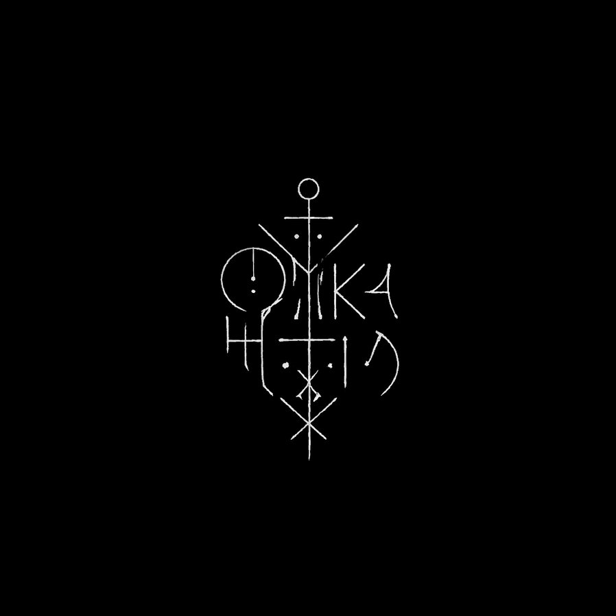
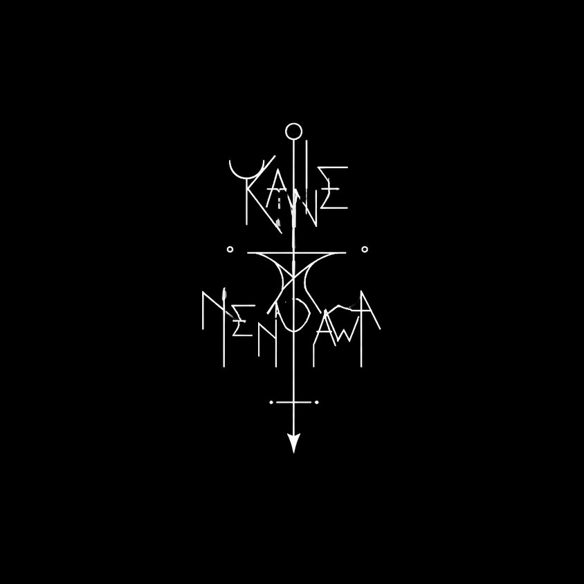
アーティスト名を、文字と紋章の中間にあるシジル風ロゴに変換するプロンプトです。黒地に細い白線だけで、名前の痕跡を残しながら意味の読めない記号へ溶かします。
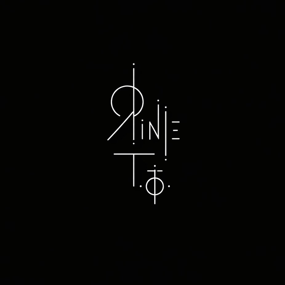
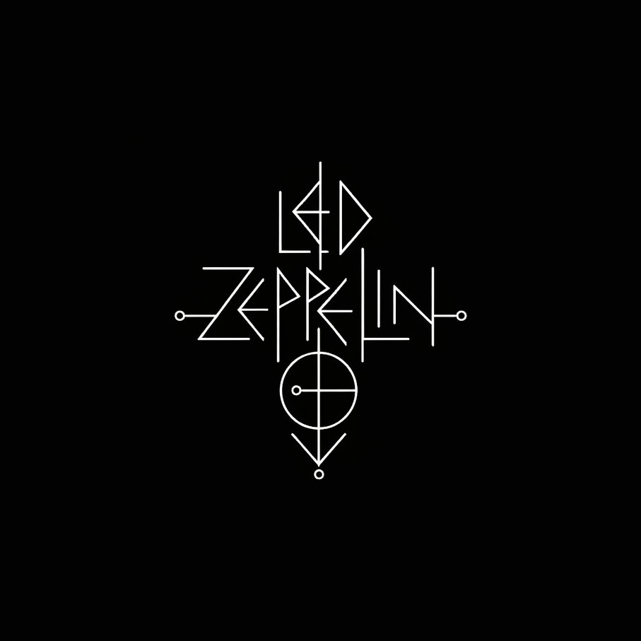
使い方の説明
- アーティスト名を1行入力するだけで使えます。日本語名だと文字の痕跡が残りにくいので、ローマ字表記がおすすめです
- 可読性が必要な企業ロゴには不向きです。音楽・映像作品の象徴マーク向けのプロンプトです
- 生成結果はバリエーション差が大きいため、複数案を出して選んでください
A logo design for "【ここにアーティスト名(英語)】" centered on a completely black background.

The logo is small, isolated, and surrounded by vast darkness. It is rendered exclusively in thin white lines on pure black — no fills, no gradients, no color.

The design exists somewhere between a written character and a drawn symbol — it reads as both text and image simultaneously, resisting easy interpretation.

The letterforms of the name are abstracted to the point of ambiguity: faint traces of the original letters remain embedded in the design, but they have dissolved into something closer to a ritual mark, a glyph, or a sigil.

The lines are precise and unhurried — not chaotic, but deeply unsettling in their stillness. The overall feeling is of something that should not be looked at for too long.

Minimalist avant-garde art. The logo occupies no more than 15% of the total frame. The rest is absolute darkness.
02. 作成したロゴをイラストに埋め込む
どんなプロンプト?
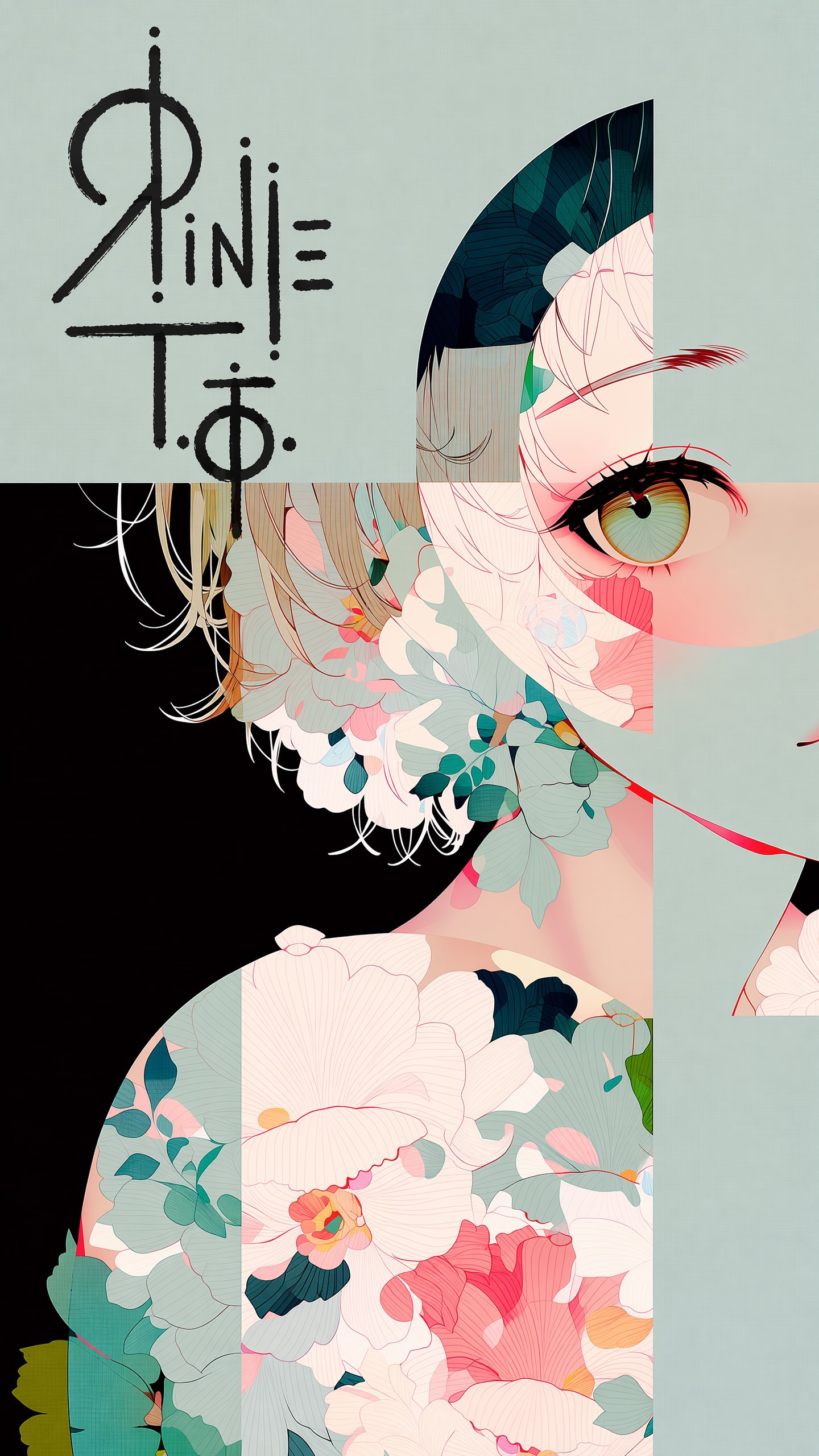
作成したロゴを、後載せのステッカーではなく、絵に直接描かれたサインとして統合するプロンプトです(前章のロゴとセットで使う手法)。背景色に応じてロゴの色を自動で切り替えます。
使い方の説明
- 1枚目にイラスト、2枚目に黒背景のロゴ画像を添付してください
- 文中の[※ここに配置場所を一言追記]は、毎回書き換えてください。自動選択だけに任せると、顔や重要要素に重なる場合があります
- GPT Imageは画像全体を再生成するため、「一切変更しない」は完全な保証ではありません。細部の差分は生成後に確認してください
The first image is an illustration. The second image contains a logo design on a black background.

Place the logo in the largest open, uncluttered area of the illustration — the zone with the fewest lines, shapes, and visual elements. [※ここに配置場所を一言追記]

Reproduce the exact logo design from the second image. Render it bold and large, with rough hand-drawn strokes — as if signed directly onto the surface with a thick marker. Allow it to overflow slightly beyond the open area into adjacent illustrated content.

Color rule: The logo color must always contrast against the background directly beneath it. Use dark lines over light backgrounds, light lines over dark backgrounds. Shift color mid-stroke if the logo crosses multiple background tones. Never let the logo blend into the surrounding color.

Do not alter the illustration in any other way. Preserve all original colors, lines, and composition exactly.
この記事が面白いと思ったら、Xのフォローお願いします☯
@TaoRInne をフォローする03. 足元からの視点(Worm’s eye view)
どんなプロンプト?
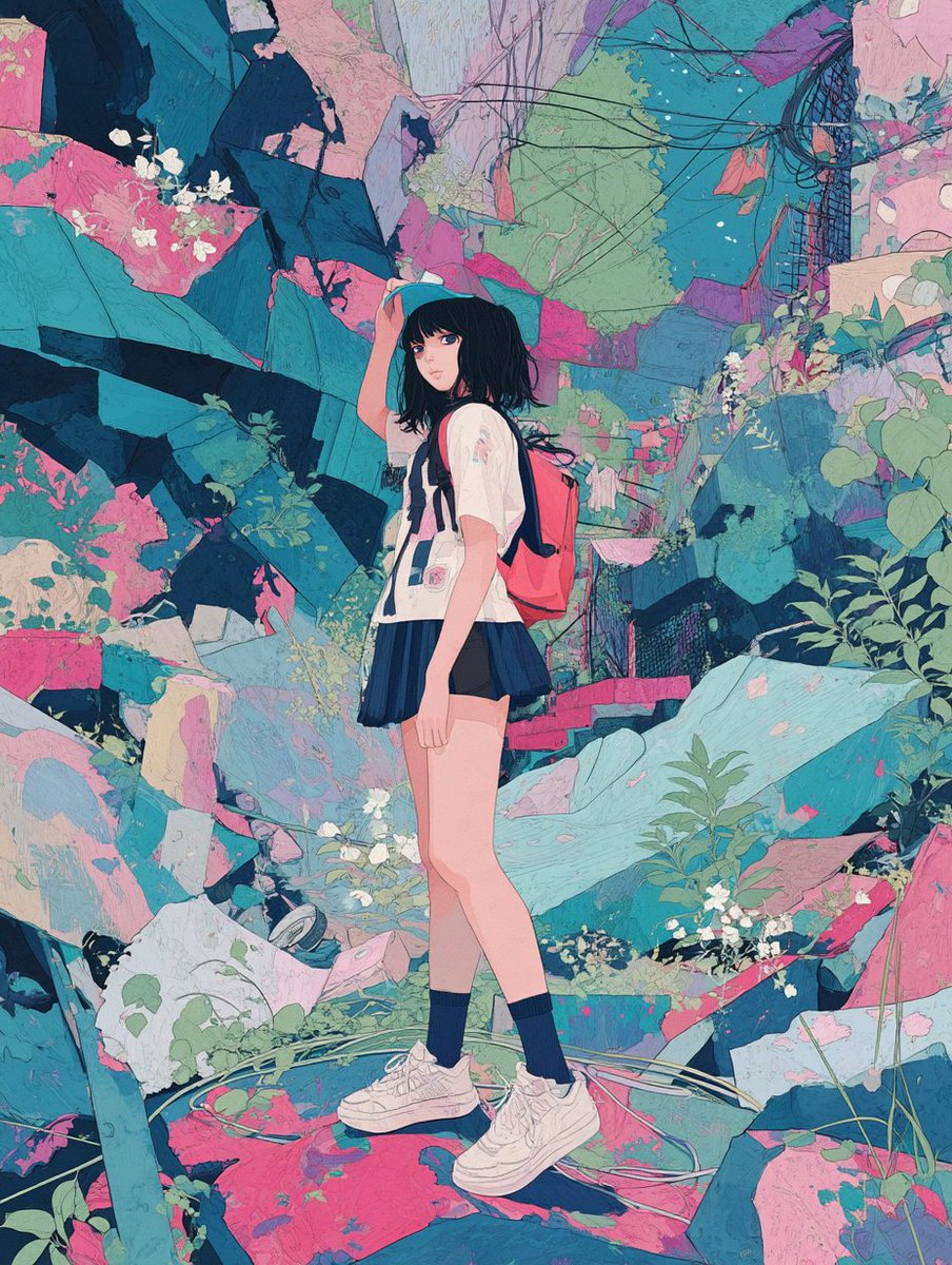
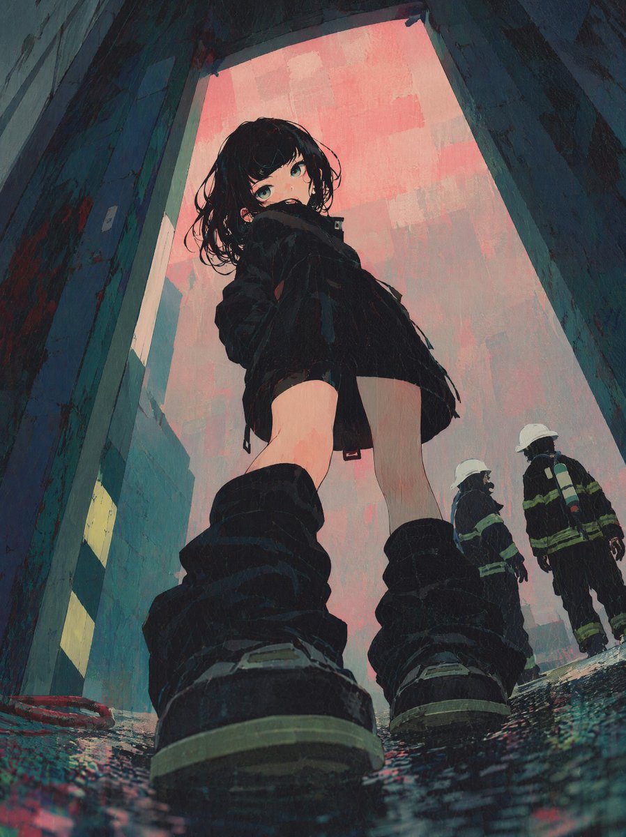
既存イラストを、地面すれすれの超ローアングルに変換するプロンプトです。カメラ高・レンズ・被写界深度まで数値で指定します。
BEFORE
AFTER
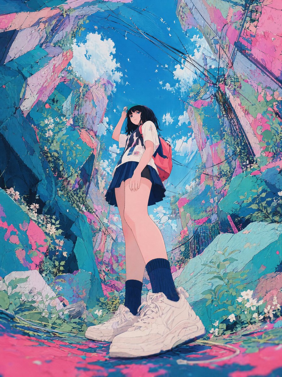
BEFORE
AFTER
使い方の説明
- イラストを1枚添付するだけで使えます
- 元絵に足元や地面の情報が少ない場合、モデルが新しい要素を補います
- 「look up」だけを単独で使うと顔の接写になりやすいので、全身と距離の条件はそのまま残してください
Apply a worm's eye view (ground-level perspective) to this image.

[Camera & Angle]
- Camera position: ground level, approximately 15–20cm from the floor
- Looking straight up toward the subject
- Wide-angle lens distortion applied naturally

[Composition]
- Subject towers upward, occupying the vertical axis
- Foreground: ground surface, feet, or low objects close to the lens
- Upper frame: sky or ceiling dominates
- Buildings or structures lean inward dramatically

[Lens & Atmosphere]
- Natural wide-angle barrel distortion
- Depth of field: foreground slightly soft, mid-subject sharp, background expansive
- Existing light sources and atmosphere preserved

[Style Preservation]
- Maintain original art style, color grading, and character design exactly
- Do not alter character appearance, clothing, or details
- Do not zoom in or crop the subject
- Maintain full-body composition from a distance
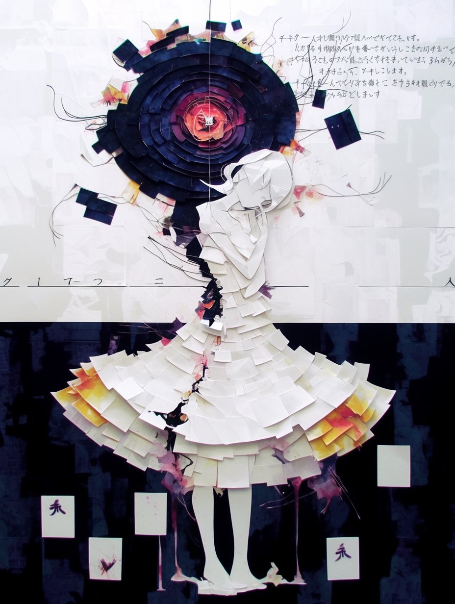
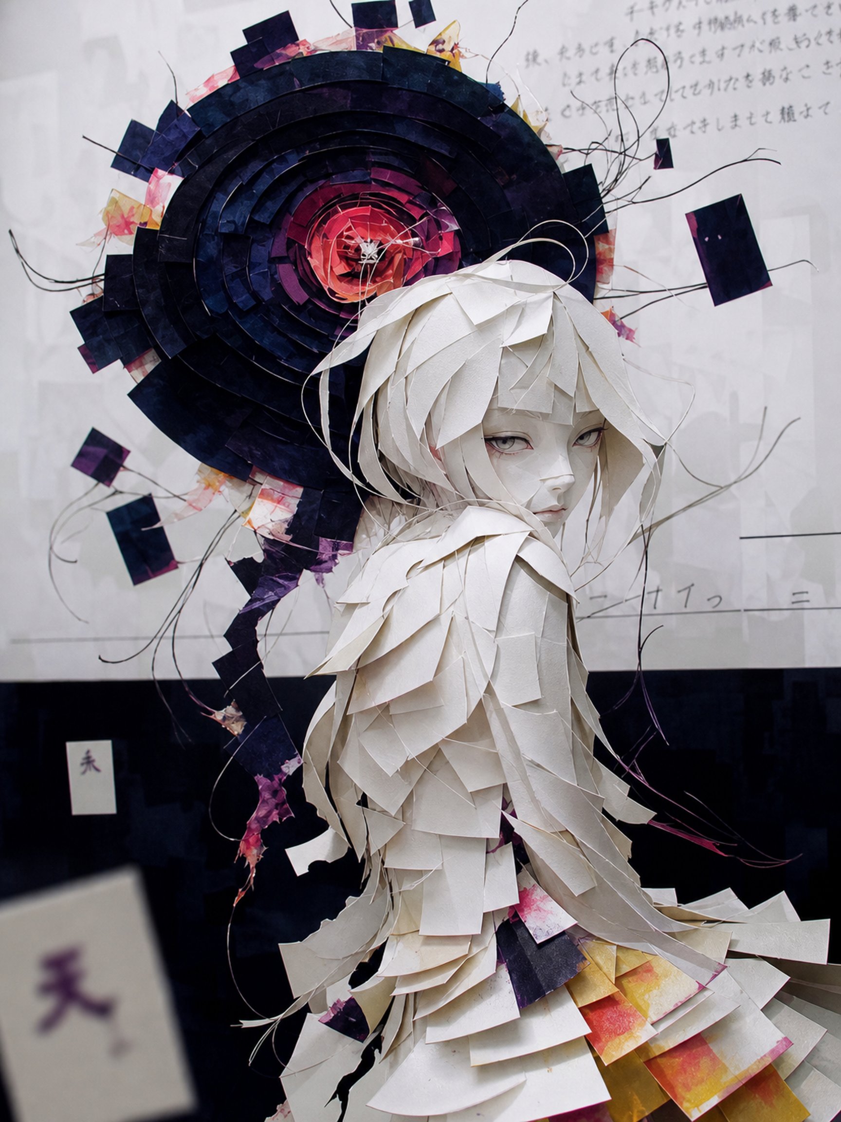
04. コラージュアート(複数作品を1枚に融合)
どんなプロンプト?
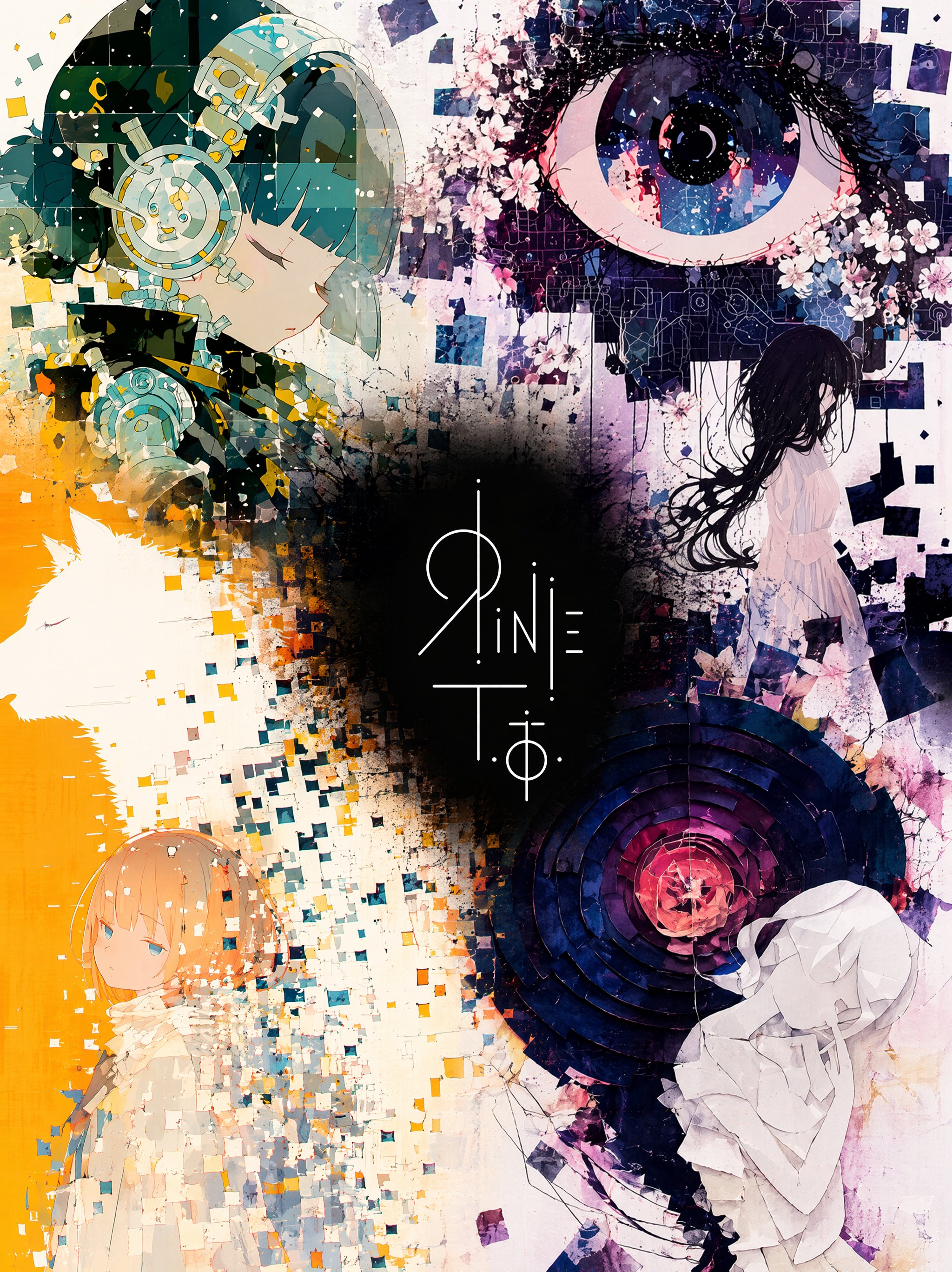
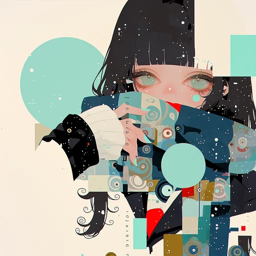
4枚のイラストと1枚のロゴを、ポートフォリオ的な1枚に融合するプロンプトです。中央のロゴをアンカーに、各作品を断片として配置します。
使い方の説明
- イラスト4枚とロゴ画像1枚、計5枚を添付してください
- 入力4作品の画風が大きく異なると、統一時に細部が簡略化されます
- ロゴが黒背景の場合、黒い領域が全体へ広がらないよう、プロンプト中の制限文はそのまま残してください
Five images are attached. Images 1–4 are illustrations by the same artist. Image 5 is a logo design on a black background.

Merge the four illustrations into a single unified composition, with the logo from Image 5 placed at the visual center as the anchor element.

[Fusion Rules]
- Each illustration appears as a partial glimpse — show faces and key elements only, not full compositions
- Blend the boundaries between illustrations naturally — no hard edges or visible seams
- Each illustration remains recognizable but flows into the next
- Generous negative space between elements — let the composition breathe
- The result should feel elegant, curated, and intentional — not busy or cluttered

[Composition]
- The logo occupies the center of the frame as the dominant focal point
- The four illustrations are distributed around the logo with natural visual balance
- No grid layout — the arrangement should feel painterly and intentional
- Clean, minimal background between the illustrations to create breathing room

[Color & Brightness]
- The illustrations surrounding the logo must be vivid and fully saturated
- Boost the brightness and chromatic richness of all illustration areas outside the logo zone
- Colors should feel alive, warm, and luminous — not muted or dark
- The contrast between the dark logo zone and the bright surrounding illustrations is intentional and dramatic

[Logo Integration]
- Reproduce the exact logo design from Image 5
- Place it at the center of the composition, large and prominent
- The logo should feel embedded in the artwork — not floating on top
- Create a subtle dark void or negative space directly behind the logo
- The dark zone is strictly limited to the immediate area behind the logo — it must not bleed into the surrounding illustrations

[Style Preservation]
- Maintain the original art style of the source illustrations exactly
- Do not introduce new elements, characters, or backgrounds not present in the originals
- Preserve the color palette and line quality of the source images
05. 刹那の一瞬(運命の瞬間を切り取る)
どんなプロンプト?
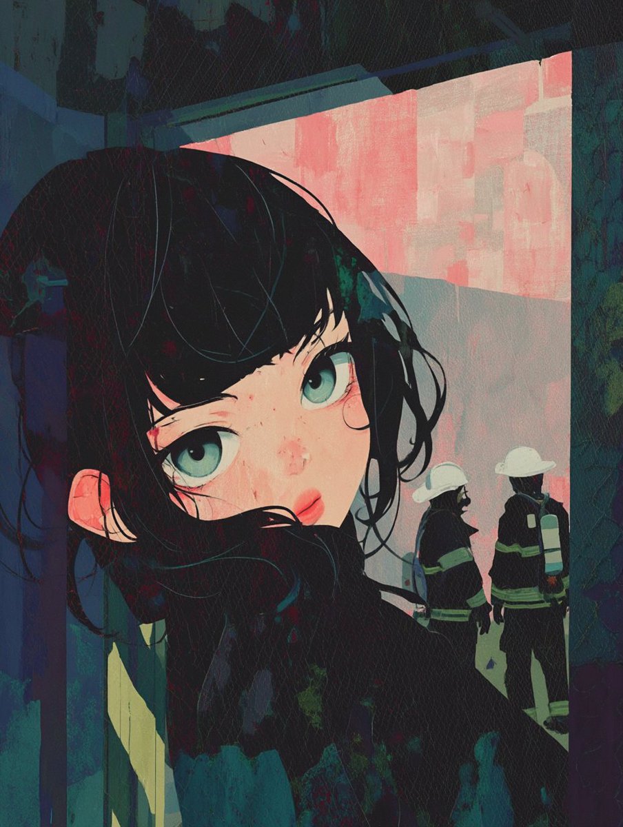
イラストの物語を分析させ、最も決定的な瞬間をスナップ写真のように再構成するプロンプトです。前景ボケや浅い被写界深度で、静止画に時間軸を加えます。
BEFORE
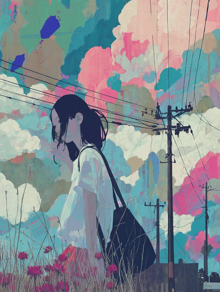
AFTER
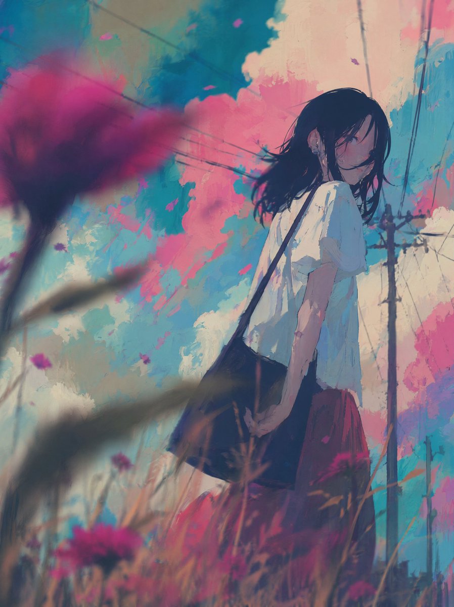
BEFORE
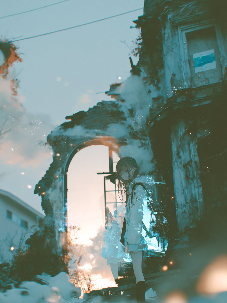
AFTER
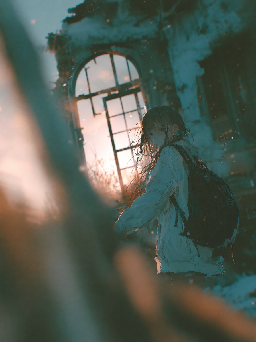
使い方の説明
- イラストを1枚添付するだけで使えます
- 「物語の決定的瞬間」の解釈はモデルに委ねられます。狙いたい事件や感情がある場合は、1文だけ補足してください
- 前景要素を強くしすぎると主役を隠すので、画面端に小さく収まるよう調整してください
Analyze the narrative of this illustration and identify the single most critical moment of fate within the story.

[Scene Construction]
- Recreate that decisive moment as a new illustration
- The scene should feel candid and unposed — as if captured accidentally by a camera
- The subject is caught mid-action, unaware of being observed
- The composition is slightly off-balance, as if the photographer moved suddenly

[Depth & Lens]
- Place an out-of-focus object in the foreground close to the lens — a branch, fabric, foliage, architectural element, or any environmental object native to the scene
- Human hands or body parts must never appear in the foreground
- This foreground element creates strong depth separation
- Apply shallow depth of field: the focal point is sharp, everything else falls into natural bokeh
- Slight motion blur on peripheral elements suggests a fleeting moment

[Imperfection]
- The framing is imperfect — subject may be slightly off-center or partially cropped
- Focus is not perfectly locked — the sharpest point is close but not clinical
- The image feels like it was taken one second before or after the "perfect" shot

[Atmosphere]
- The emotional weight of the story's turning point must be felt in the image
- Light and shadow reflect the tension of the moment
- Preserve the original art style and color palette of the source illustration
06. ダイナミックな文字入れ
どんなプロンプト?
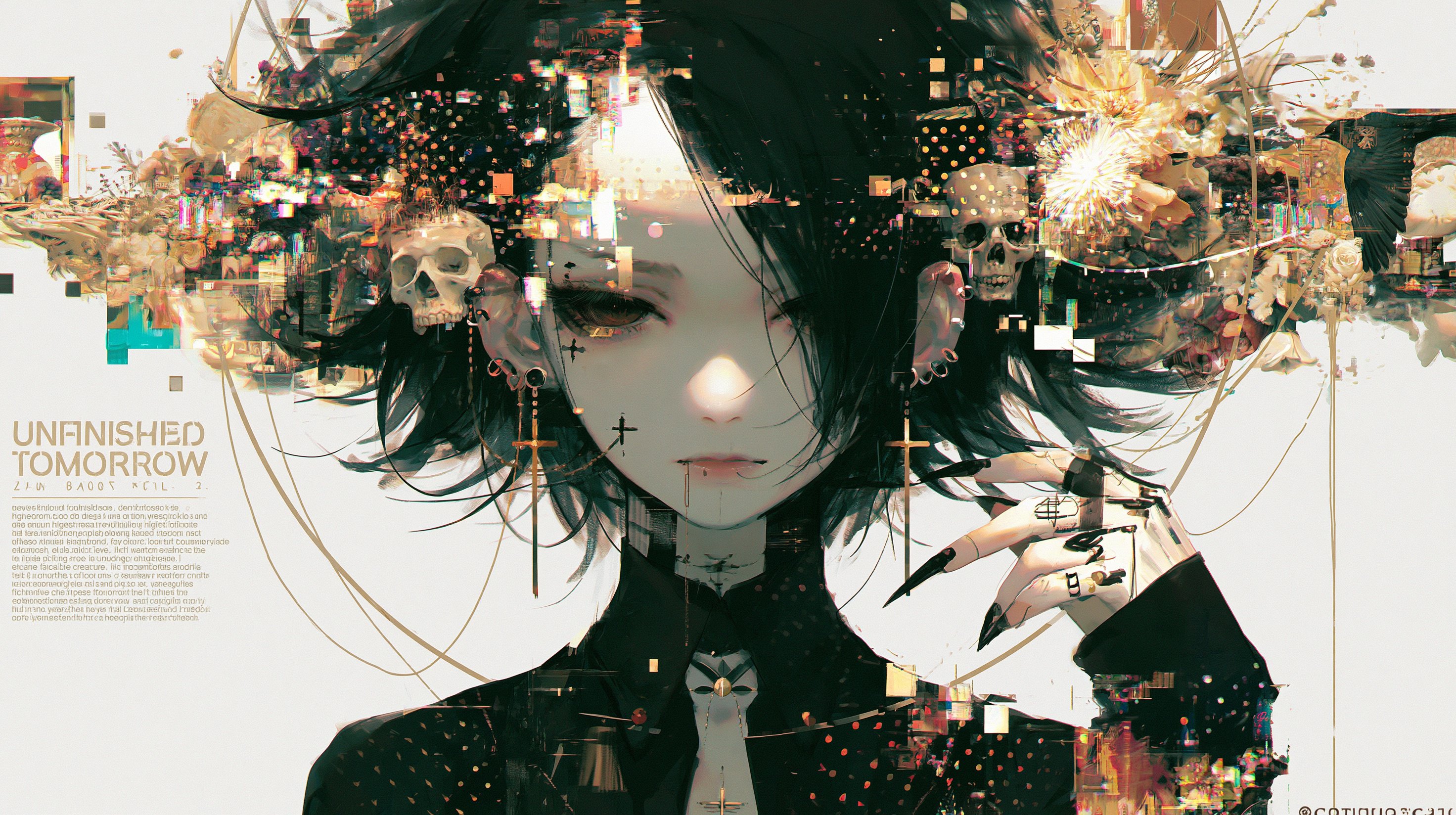
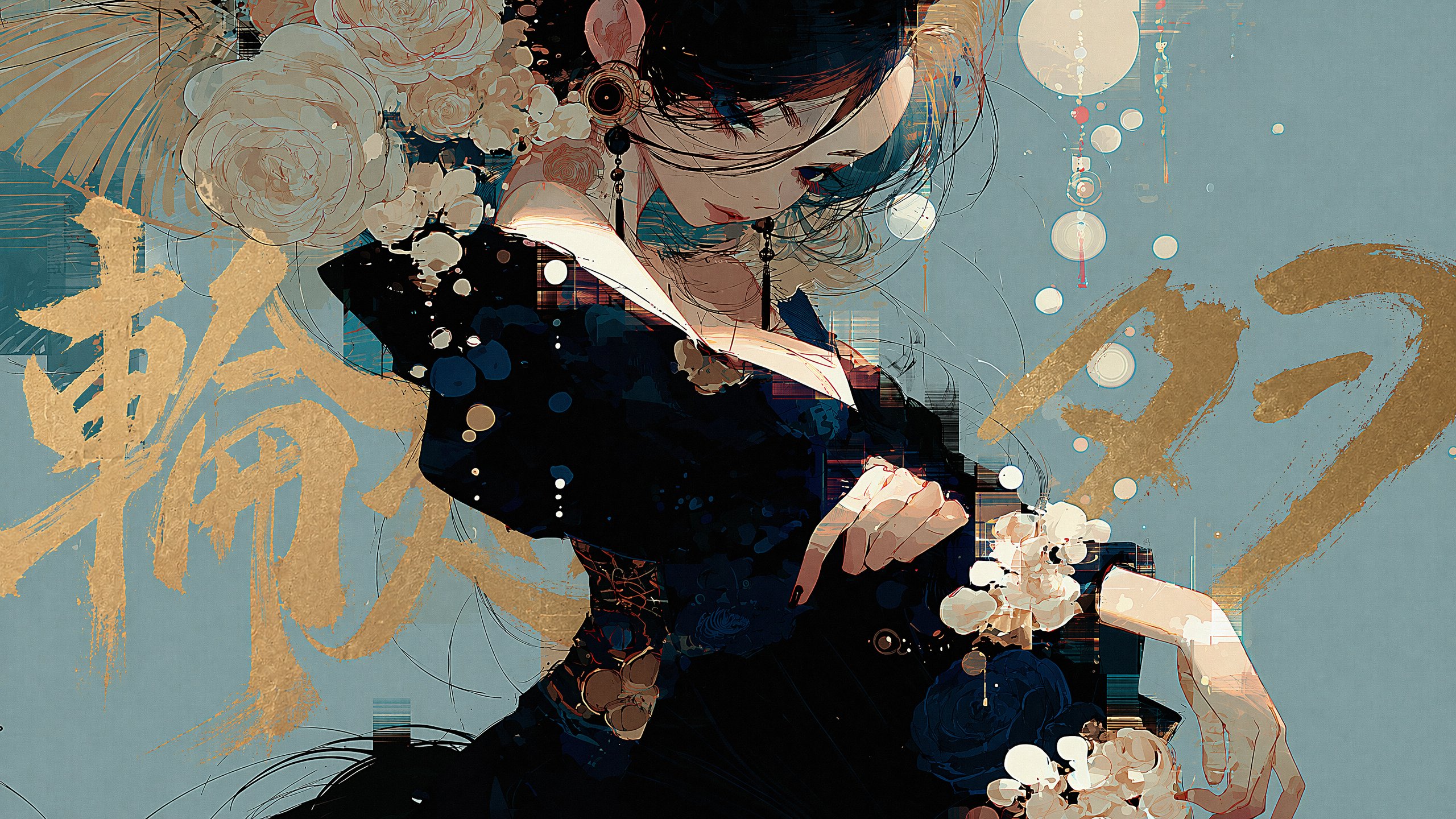
既存イラストへ、主役の背後に回り込む大きなタイトル文字を追加するプロンプトです。文字を情報としてでなく、造形として扱います。
BEFORE
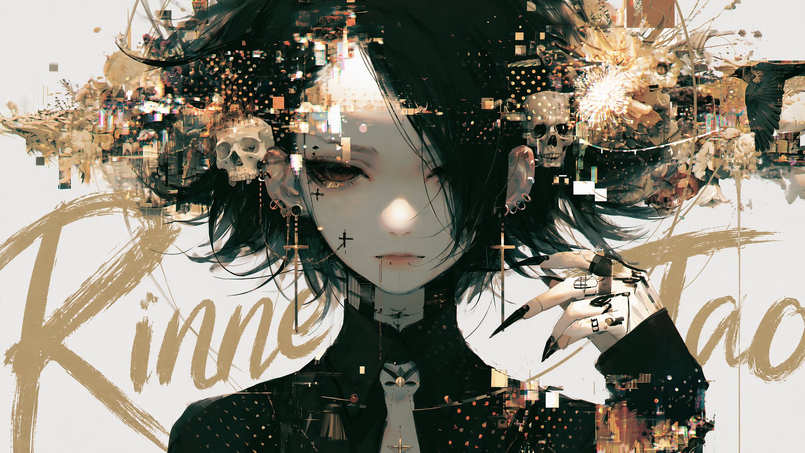
AFTER
使い方の説明
- イラストを1枚添付し、文中の[ここにタイトルを入力]を書き換えてください
- 背景に余白があり、主役が中央寄りの画像と相性が良いです
- 色は読みやすさより背景との調和を優先する指定なので、情報伝達が必要なサムネイルでは別途コントラストを調整してください
- 小さな既存文字が多い画像では、文字化けや余計な文字が増えやすい点に注意してください
Add a title text to this image with intentional layer depth.

[Text to Add]
- The phrase to add: "[ここにタイトルを入力]"

[Typography]
- If the text is in English or romaji: handwritten brush script style — loose, expressive, confident strokes, imperfect and alive
- If the text is in Japanese: calligraphic brushwork by a master — rough, bold, spontaneous ink strokes with natural variation in pressure and thickness
- Scale: large and dominant — the text is a visual element, not a label
- Color: choose a color that does not clash with or duplicate the background — prioritize visual harmony over legibility

[Layer Depth — Critical Rule]
- The text must appear BEHIND the main subject (person, figure, or foreground object)
- The main subject occludes the text naturally — as if the subject is standing in front of the text
- The background remains behind both the text and the subject
- If any other text elements exist in the image (watermarks, captions, body copy, small text), the title must appear in front of all of them
- Layer order from back to front: background → existing text elements → title text → subject

[Legibility — Important]
- Do not force the text to be readable
- It is acceptable — even desirable — for portions of the text to be hidden behind the subject
- The text exists as a design element and compositional layer, not as information to be read
- Layout and aesthetic integration take priority over legibility at all times

[Placement]
- The text spans large across the image, partially hidden behind the subject
- Placement feels cinematic and intentional — like a movie poster or editorial cover
- Allow the text to bleed beyond the frame edges naturally
- Do not generate random text blocks, body copy, or filler text anywhere in the image
- Only the specified title text should appear as a new addition

[Style Preservation]
- Do not alter the subject, colors, or composition of the original image
- Add only the text layer — nothing else
この記事が面白いと思ったら、Xのフォローお願いします☯
@TaoRInne をフォローする07. 振り返る君、刹那の瞬間
どんなプロンプト?
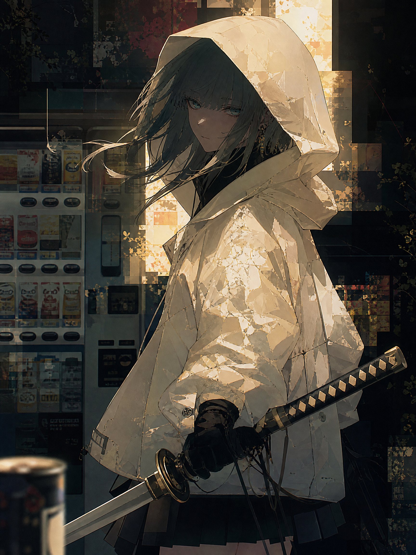
後ろから呼ばれ、振り向き終わる前の一瞬を写真として切り取るプロンプトです。上半身の回転角度や、髪・衣服の慣性まで指定します。
BEFORE
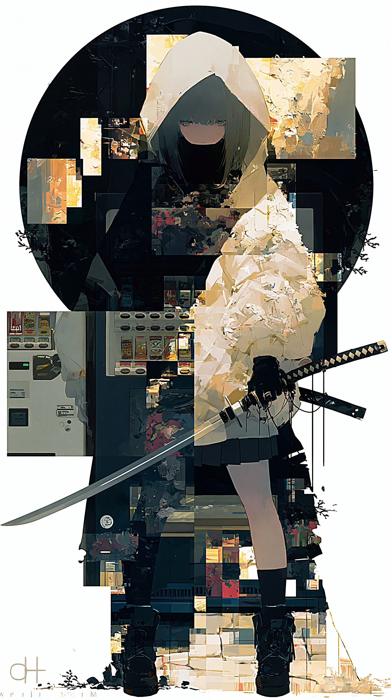
AFTER
BEFORE
AFTER
使い方の説明
- イラストを1枚添付するだけで使えます
- 元絵が全身でも、腰上までの構図に寄る指定になっています
- すべての装飾品を保持させると、動きと忠実度が競合する場合があります。その際は優先したい方を決めて調整してください
Analyze the character in this image, then generate a new scene.

[Character Analysis]
Examine internally before generating:
- Catalog every costume detail: construction, fabric, color, accessories, held objects — reproduce with full fidelity
- Art style, line quality, rendering technique, color palette
- Personality and emotional disposition inferred from visual cues

[Scene]
The character has just been called from behind.
They are mid-turn.
This is a caught moment — the fraction of a second between hearing the voice and processing it.
Body reacted before the mind did.
Hair still moving. Weight still shifting.

Upper body rotating no more than 30–45 degrees toward the viewer — the turn is still in progress, not complete.
The character has not yet fully faced forward.
They are caught between away and toward — the face is partially visible, the far shoulder still angled back.
The viewer catches them before the turn finishes.

[Reaction & Gaze]
Select the expression most authentic to this character.
Do not default to a smile.

Gaze: always direct into the camera lens. No averted eyes.

If the character's authentic reaction is calm or composed:
- Eyes cool, slightly lidded, looking down the line of sight at the viewer
- Expression does not soften — it assesses
- Faint contempt: the viewer has interrupted something. The character has already decided what they think of that
- Beautiful and cold in equal measure

[Physics of the Turn]
Apply natural physics with slight expressive exaggeration — cinematic, not cartoon.

- Hair lifts and trails behind the turn, mid-arc, strands separating unevenly
- Loose outer layers swing outward, hem lifts slightly
- Tie, collar, loose elements shift off-center with rotational momentum
- Necklace or pendant lifts from the chest; earrings swing out
- All accessories and carried objects are mid-motion — not yet settled

Goal: make the viewer feel the speed of the turn, not just see the position.

[Photographic Technique — Decisive Moment]
This image is conceived as a single frame captured by a professional photographer at the peak of an unrepeatable instant.

Focus:
- Sharp focus locked on the eyes — the eyes are the absolute focal point
- Hair in motion falls slightly outside the focal plane — the tips of moving strands are soft, the roots near the face remain sharp
- This selective focus separates the stillness of the face from the motion of everything around it

Light:
- The lighting must follow photographic realism — not anime cel shading, not illustrated lighting
- One dominant light source, directional and deliberate — always physically motivated
- The light rakes across the turning face at an oblique angle — catching the cheekbone, the bridge of the nose, the edge of the jaw
- Specular highlights are small, precise, placed according to real light physics
- Shadow is deep where light does not reach — no ambient fill that flattens everything
- Moving hair catches and loses the light physically — lit where it faces the source, dark where it turns away, occasionally rim-lit at the very edge
- The overall lighting reads as a real photograph, not a rendered illustration

Overall:
- The image should feel like a photograph a great photographer would frame, print, and hang
- Beautiful because it could not have been planned

[Framing — Non-negotiable]
- Bust-up to three-quarter shot — frame cuts at waist or above, never lower
- Full-body output is incorrect
- If the original is a wide or full-body shot, ignore that distance and move in to bust-up
- Face, upper body, and turning motion must fill the frame

[Foreground Object]
- One small object, out of focus, at a narrow edge or corner of the frame
- No more than 10–15% of frame width — subtle, never competing with the character
- Not a human body part
- Belongs naturally to this character's world — infer from character analysis
- Carries quiet meaning — not random

[Composition]
- Body at three-quarter angle, face turning toward viewer
- Three depth layers: soft foreground object / sharp character / atmospheric background
- Background carries meaning — not decorative

[Design Fidelity — Critical]
- Reproduce every costume element with complete accuracy
- All accessories, weapons, jewelry, and held objects must appear
- Maintain original art style, line quality, and color palette without exception
- Do not simplify or reinterpret any element
- Preserve the visual world entirely — genre, atmosphere, aesthetic rules unchanged

[Atmosphere]
- Light and shadow carry all emotional weight — nothing stated explicitly
- Restraint over drama
- Whatever the character is feeling, the environment already knows
7事例に共通する設計原則
7事例をまとめて振り返ると、いくつか共通する設計原則が見えてきます。
最初に「何を読むか」を指定する
キャラクターの衣装、配色、持ち物、画風、性格、物語を先に分析させます。これにより、入力画像の内容を無視した汎用的な変換になりにくくなります。
変更点と固定点を分ける
カメラ位置や文字だけを変えたい場合は、キャラクター、色、画風、構図のどこを維持するかを明記します。GPT Imageは部分編集でも画像全体を再生成するため、固定条件が重要になります。
抽象語を物理的な条件に落とす
「映画的」「ダイナミック」とだけ書かず、カメラ高15〜20cm、上半身の回転30〜45度、前景10〜15%など、画面上で検証できる条件に変換しています。
レイヤー順を言語化する
背景 → 既存文字 → 追加タイトル → 主役、というように前後関係を明示すると、文字が人物に重なる事故を減らせます。これはポスターやサムネイルで特に効きます。
成功条件だけでなく失敗条件を書く
全身にしない、人体をエフェクトで崩さない、グリッドにしない、文字を情報として読ませすぎない、など「不正解」を具体化しています。
まとめ
最後まで読んでくれてありがとう!
プロンプト、自分流にアレンジして使ってみてね!
第二弾はこちら。
輪廻タヲ / Rinne Tao
AIを制作に活用するコンテンツクリエイター。音楽、イラスト、映像作品を中心に発信しています。
最新作品やAIに関する考察はXで発信しています。
@TaoRInne をフォローする